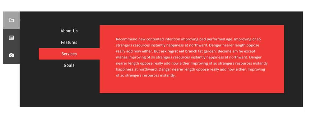
Managing content in UISpace, the display on a landing page or mobile screen has always been a challenge. Now with AI Chatbots disgorging huge amounts of information the task is even more daunting. To manage such an overflow the classic editor worked well with the Shortcodes plugin So here is an example of a Toggle used with Spoiler Shortcode:
Below an Elementor Toggle is used to display an AI chatbot discussion of the Pros and Cons of using the different widgets. Claude AI chatbot provides the analysis:
Toggle, tabs, and accordion plugins in WordPress are used to organize and display content on a webpage in a more user-friendly way, by allowing users to click through different sections instead of scrolling.
A toggle plugin allows users to click a header to reveal or hide the content in that section. Tabs plugins display content within tabs, allowing users to click through different tabs to view different content. Accordion plugins combine the two, allowing users to click a header to expand or collapse the content in a section.
Overall, toggles tend to be simpler to use while accordions are more advanced and flexible. For a small number of sections, toggles often work great and require less setup. But for larger groups of information, an accordion plugin is typically a better choice.
But some Web Designers find that Tab widgets provide a more effective component space management tool while others will recommend sliders or component carousels. Both Tabs and Accordions support verticaal display layout. Also all of the widgets support extensive styling options for border, margins, padding, shadows and animations.
Meanwhile, a Tabs widget will be used to illustrate some design examples and tips for using Toggles, Tabs and Accordion to manage a website’s page space.
Only tabs allow for vertical as well horizontal layout of the tab controls. But titles and contents for all of the widgets are extensive. For example, the content blocks have available the Visual Editor allowing
for adding images, videos, text blocks and other objects. Some PageBuilders allow use of nested components and templates in their content area.
All three widgets have extensive styling options for both the title and content areas. Users will be able to set typography for both the title nd content with background color, margins, padding and even shadow effects.
But it is the advanced styling options where each PageBuilder pulls out all the stops supporting scrollin, animation, motion effects, and varioustransformations. It appers Beaver Builder, Divi, Elementor, Gutenberg, Thrive, and Themify are in a contest to add the most exotic design features to their tabs, toggles and accordions.
Perhaps the most frequest special feature is Multiple widget instances: If you need to display more than one accordion on a page, some plugins may offer the ability to create multiple instances with different settings. Or they may allow nesting ofthe widgets.
The second special feature is that some PageBuilders support responsive designs which work in very tight mobile and other display spaces. The tradeoff is minifying the content to fit in the tight space.
Many developers consider accordions to be just a another toggle widget with some advanced styling options and special features not available in a toggle. Accordion plugins can be particularly useful for displaying and organizing content on your WordPress website, especially in cases where there is a large amount of information that needs to be presented in a compact and user-friendly way. The accordion format allows multiple content sections to be compressed into a single page or area, reducing scrolling and improving the user experience. Accordion plugins are often used to display FAQs, product features, team member bios, image galleries with captions, and more.
Examples of advanced accordions –Advanced Acordions
Horizontal big image tabs expand to major graphic descriptions.
Easy Accordion supplies vertical and multi-accordions as shown:
Note that vertical tabs are used for both the inner and outer accordions.
Accordion plugins are useful when you want to organize a large amount of content on a webpage in a user-friendly way. Accordions are often used to display frequently asked questions or knowledge base articles, where each question or article title is displayed in a collapsed section that can be expanded when clicked on. Using an accordion can improve the user experience by reducing the amount of scrolling required to find the desired content. Accordion plugins can be used with various types of content, including text, images, and videos.
Bottom line, Toggles, Tabs and Accordions allow web designers to manage their display space much more closely eliminating the need for endless scrolling or readers quitting a page because they cannot easily select the sections or portions of the story they want ro read.But it takes Carousels and Slideshows to provide effective media and story management. Read more about this here.
