The Mobile Presence Meetup was filled with as many questions as facts and answers. However, important facts evident in the presented Hootsuite slides – Mobile device usage, at 92% of all internet connections. simply demands attention. And the the second HootSuite slide puts “mobile devices” into perspective – it shows the multiple flavors for mobiles with their unique screen device sizes , operating systems, and hardware empowerment – from game consoles to feature phone through smart watches to TV streaming devices and all the Internet of Things in between – mobile devices are far from uniform in their computing characteristics. This is the crux of the mobile software challenge – so many devices with widely varying operational needs
With so many devices it should not be a surprise that mobile devices account for 52-55% of all US retail sales depending who is doing the counting. But clearly developing for the mobile market is a challenge on how to effectively service so many screen spaces, operating systems and different client needs.
There is a need for organizing standards for mobile internet interactions. And indeed, a flock of standard organizations are seeking to shape this mobile device world. This raised the question what is the role of Google in shaping the mobile evolution This was also the first of many queries with tenative answers.
Google Rules Mobile Standards
There are many players in the Web Standards game but Google has a preeminent role with PageSpeed Insights and its mobile-first performance results, Google SEO rankings that favor mobile performance over desktop, annd its mobile speed boosting tools like PWA-Progressive Web Applications. Yes, Google has a dominant browser worldwide market lead of 77.1% and a whapping 91% worldwide lead in search engine usage – both key Web advantages.
But in CSS and HTML standards Google is a contributor but not technology leader. Likewise in Web Programming Google has little impact in PHP, diminishing influence in Java, but a stronger role in JavaScript with its V8 JavaScrpit enegine and the Angular.JS framework. Still the question was raised at the meetup why the major Google role in mobile device support tools. The following post provides some hints but te question is still open.But there was no question that Google inspired PWA-Progressive Web Applications does work as we created live PWA apps both on desktop and mobile home screens.
These PWA apps then linked to landing pages with fast reponse time. The demo also showed that offline operation of the app would support access to pages and post data stored in the PWA cache.However, the response time improvements and setup of mobile notifications were both exercises were left to be done and shown in the follow up meetup in May.
Likewise AMP-Accelerated Mobile pages in WP were implemente partially. Unfortunately some of the ambitious mobile page refinement screens failed to show. Also, the timings for the AMP pages were not measured – so until the second May meetup, these details will be on hold.
Other Mobile Recommendations
However, there was plenty of opportunity to review recommendations for deciding when to upgrade your hosting service. Of late, this developer has found that shared hosting with reputable suppliers like A2Hosting, SiteGround and WHC.ca has problems with response time, hack attacks, and changing control panel services. Given these problems Cloud Computing at $300 to 900/year has attractions. Or if you have the DIY chops, using VPS-Virtual Private Servers can deliver great response time, at half the cost and equivalent backup and security.
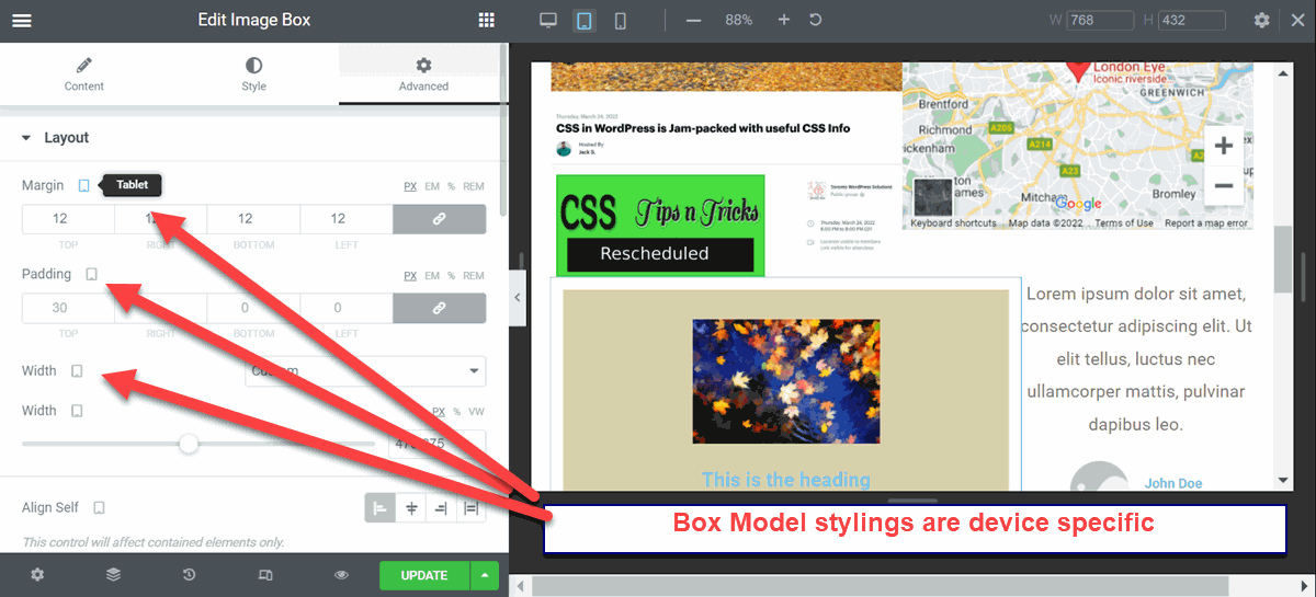
As for 1st and 2nd order repoonsive design, that was easy to demonstrate`All modern modern PageBuilders deliver 1st order responsive designs suited to mobile requirements like stacking sections in tablet and mobile view and auto-reducing menus to hamburger icon and underling vertical menu. But second order responsiveness is more selective. Designers can change to typography, spcing separately for tablet and mobile view while leaving dektop layouts untouvhed as seen in this screenshot:
 Some PageBuilders like Elementor and Divi go a step further and allow designers tohide in tablet or mobile view some components. Also these tools allow designers to set the view breakpoints for special devices. The overall result is that tablet and mobile pages can look as polished as desktop pages.
Finally there is new direction of LCAD-Low Code Application Development coming from the Enterprise Development community. What LCADdevelopers use is JavaScript Frameworks that dynamically asign HTML, CSS, and JavaScript for each device page. Of course this means specially desgned pages customized for any device and